

Customer-Centric Credit Card UX Design
As we hit the major holiday spending season, it’s worth noting that the credit card industry can be very predatory in tactics to make more money off consumers by making enticing offers for credit cards to get customers to spend more money than they can cover. This is especially true of retail store credit cards that have higher interest rates than what many major credit cards offer. Credit cards partnering with retail stores entice customers with an exclusive percentage discount on purchases or offer zero percent interest payment terms for higher purchase amounts.
Most fiscally savvy consumers know that if you're not careful and paying close attention to the interest free payment terms, you'll be subjected to usury fees that make the debt very expensive at rates of 20-30% interest, much higher than most consumer-friendly rates of 10-15% interest. This is confirmed by sources pulled from Perplexity.ai, including research from bankrate.com saying:
The 2025 Bankrate Retail Cards Study reveals the average retail card APR remains above 30 percent, which is the second-highest average rate since 2008.
“Card issuers say they charge higher interest rates on retail cards because these cards are easier to get, and delinquencies have increased in recent years,” says Ted Rossman, Bankrate senior industry analyst. “But these are really high rates, and they often apply to all customers who carry balances.”
https://www.bankrate.com/credit-cards/news/retail-store-credit-card-survey/
https://www.perplexity.ai/search/a6791e77-004a-4de9-9093-1802aa7c3032#1
Not all retail store credit cards user experiences feel like they’re trying to capture users in a high interest trap.
Here are examples of credit card statements and website/mobile app designs that offer completely different ways to inform the customer about how to avoid those high interest charges. How these companies treat customers through design decisions says a lot about how they prioritize the customer and user experience.
One example goes above and beyond to show empathy for those struggling financially due to circumstances that may not have been under their control.
Let's start with the one that's less convenient and more costly to consumers:
Lowe's credit card is managed by Synchrony. EDIT: They shifted their UX to a consolidated platform with other Synchrony credit cards after once being accessed through Lowes.com.
Here’s a screen shot of their mobile web user experience. Below that is CareCredit, also managed by Synchrony.
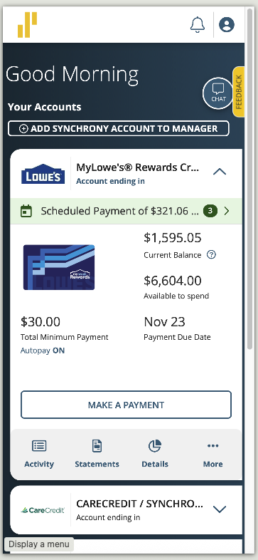
Like many retailers, Lowe's offers 0% finance charges on limited time offers for purchases of higher amounts, usually around $30000. It gives customers more time to pay for something they may not have cash for, and if you plan well, this gives you time to spread out costs and pay the same amount as if you paid in full that day. Operating your household budget like a business, delaying expenditures at the same cost of low interest or free debt with proper planning while collecting consistent revenues is a sound method to managing finances.
Appliances are usually a big ticket item for consumers and you never know when they’ll fail, so if you don't have cash to pay for them when when they fail, are unable to wait for a repair service to solve the issue with high labor costs and hope they have the parts and aren't getting tariffed into higher costs of repair, and can wait for the repair person to come back and complete the repair, it's often just easier for consumers to buy a replacement in a local warehouse that retailers want to profit from. It's really frustrating to have an appliance die on you, especially when we're so dependent on them in modern life. And they're often harder to repair than they used to be, because manufacturers make more from sales than they do from offering parts for repairs.
It's not difficult for anyone able to plan out the cost and average out the total amount owed before the date your interest-free loan terms expire.
For Lowe's Synchrony customers, they could manually enter that amount into an autopay system, assuming it averages out to be an even number between the X number of statements left to pay.
But what if you make additional charges to that store card, and you have to pay off those charges to avoid interest by the next billing statement, AND still have to make the autopay amount that has to be paid before the end of the interest-free loan terms are up?
Now you have to manually add another payment to the plan you calculated to pay off the interest-free loan. This becomes more work for the user and how obvious it is to customers varies wildly in the design of the retail credit card user experience.
It was customary to get printed statements in the mail, but Synchrony now charges $1.99 to mail out statements to customers to offset their printing and mailing costs. If you do a lot of financial management on your Android or iPhone, it can be hard to read their PDF statements on such smaller mobile screens, even if the average size of smartphones has increased. Mobile optimized websites help, but how obvious is it about what payment the user needs to make to avoid costly interest fees?
Lowe’s are now more challenging to see that, and make it harder to find the PDF statements, which are not mobile optimized.
Comparing this experience to other credit cards, there are other UX designs that are more consumer friendly.
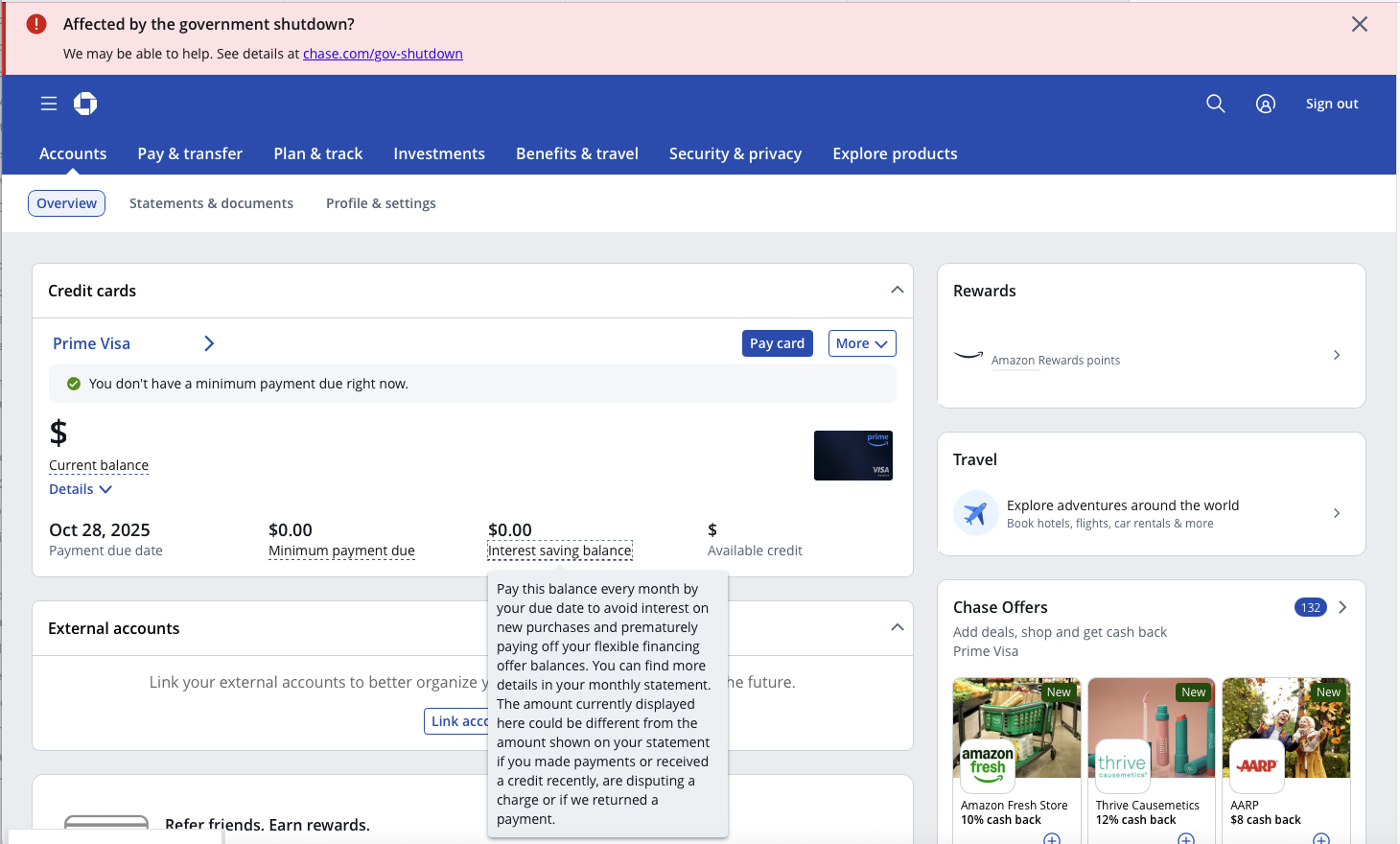
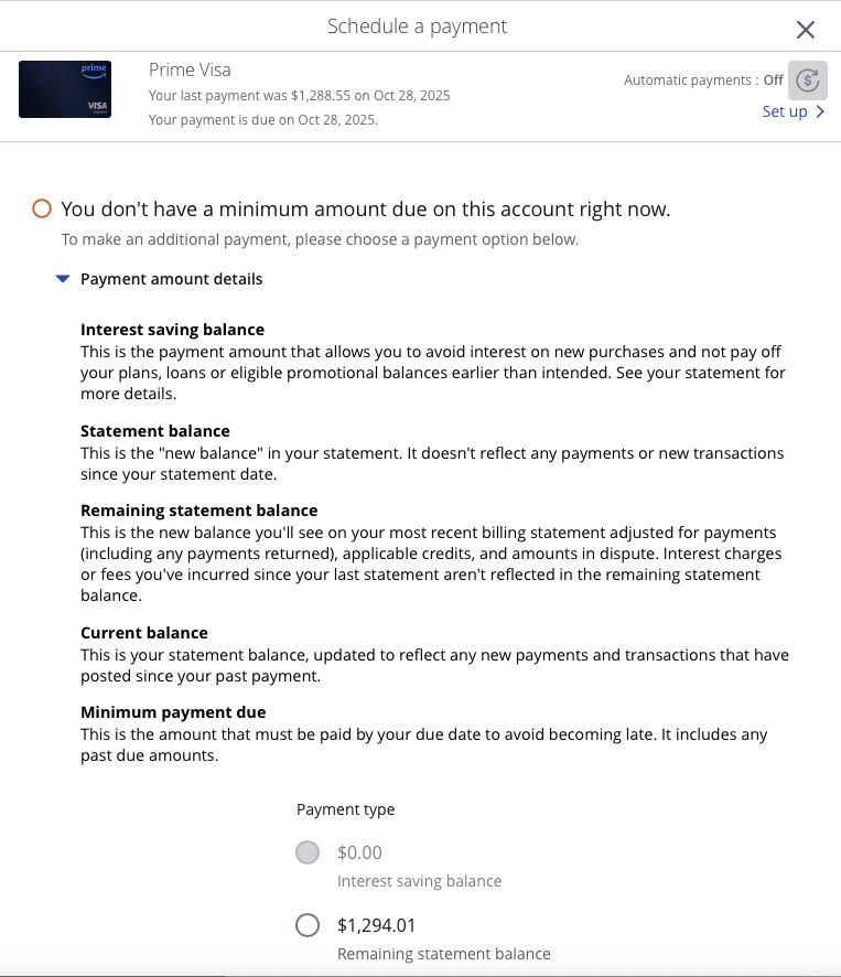
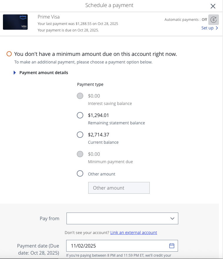
Chase's Amazon card does the math for the user and makes it more clear what you have to pay to avoid interest for both monthly purchases due before the next statement due date AND the interest-free loans you still have.
Their "Interest saving balance" combines both into a single payment the user can pay to avoid paying any interest. View the gallery of screenshots below to see it in context:

They're not the only one doing this.
Kohl's recently started using Capital One to manage their store card and they're using a consumer friendly similar convenient calculation that Chase's Amazon card is:
Some retailers are working with financial services firms to help customers manage their credit card debts and making it easier to avoid incurring high interest charges, not harder. This is a trend I love to see as a user experience designer. Being more empathetic to those who have busy lives, less cash on-hand to make major high ticket purchases, and may be struggling to get by. I know financial experts advise against the use of credit cards for things you can't afford, but showing empathy for loyal customers engenders trust that the store or the bank isn't purely looking to exploit customers with credit cards or offering a badly designed UX that makes it harder to avoid paying interest as a frequent and loyal customer. As a result of this UX, I decided the Synchrony Lowe’s credit card wasn’t a consumer friendly UX and I cancelled it favor of using more customer friendly cards.
One more thing...
Did you happen to notice the big red banner at the top of the Chase screenshot?
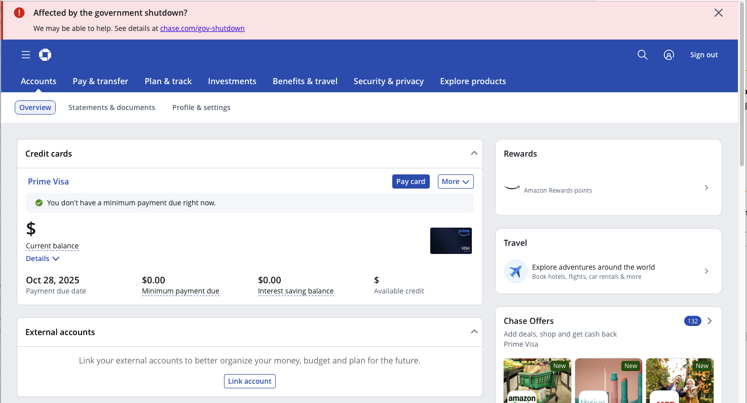
Chase looking out for its customers in a difficult time
That's a bonus point for empathy and situational awareness of what most U.S. government employees (and contractors working with the federal government) were facing during a the longest government shutdown in relevant recent history lasting 43 days.
This created financial instability thanks to yet another prolonged government shutdown during this second Trump administration. This is a situation that is not the fault of most federal employees, and I think Chase should be commended for showing this level of empathy for their customers.